"We're currently working on optimizing ValuOrb for mobile devices. We recommend viewing this site on a desktop browser. Stay tuned for mobile updates!"

ValuOrb
User Manual
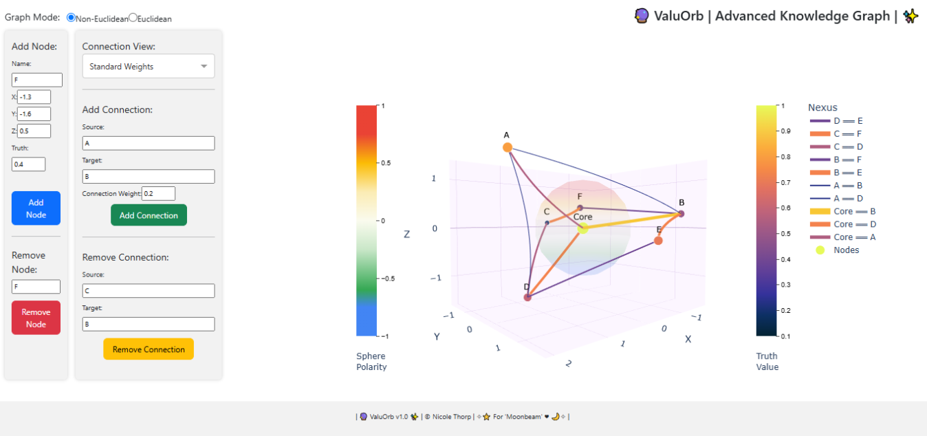
Graph Mode
-
Non-Euclidean: allows for visualizing non-linear connections (bendy lines) between data points.
-
Euclidean: illustrates linear connections (straight lines) between data points.
,
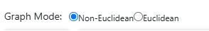
Sphere Polarity
Visualize the 'positive' or 'negative' perception of data points through their position around the sphere.
"Positive" & "Negative" are often considered subjective and rely on surrounding context. These values are mapped with the Z-axis.
Truth Value
Color represents confidence or certainty (truth values) of data points.
Warmer Colors = Higher Values
Cooler Colors = Lower Values
This is crucial for understanding data points & their connections.
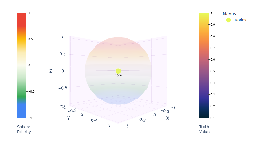
Connection View
Select different visual modes to represent connections.
-
Standard Weights: This mode displays connections with a color and width corresponding to their weight. (This is the baseline, using only the connection strength.)
- Truth-Influenced: This mode displays connections with a color and width that are influenced by the truth values of the connected nodes. (This focuses on the combined truth values of the connected nodes.)
- Distance-Weighted Truth: This combines both distance and truth values.
-
Distance Map: This isolates the effect of distance. (Edges are assigned weight based on distance between nodes.)
- Nodes Only: This mode displays only the nodes on the sphere. ( Removes edges entirely.)
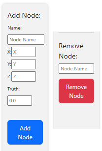
Add Node
Allows adding new nodes to your
ValuOrb by specifying their name,
position (X, Y, Z), and truth value.
X & Y determines local placement.
Z-axis determines polarity/height.
Truth values are limited to 0.0 - 1.0
Remove Node
Nodes can be removed by typing in their name.
Remember:
Removal is case sensitive.
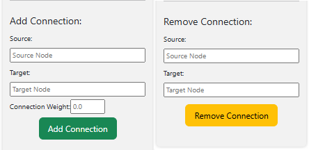
Add Connection
Add connections between nodes
on your ValuOrb by specifying their
names and a weight value.
The color of the connection changes
depending on the connection view selected.
This color indicates weight value.
Weight values are limited to 0.0 - 1.0
Remove Connection
Connections can be removed by typing in the names of the connected nodes.
Remember:
Removal is case sensitive.
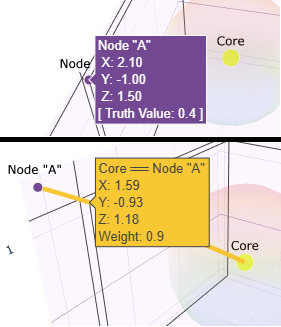
On Hover Popup Info
When the cursor rests on a node or connection, a small window of information appears.
- Name Of Selected Node or Connection
- Current X-axis Position
- Current Y-axis Position
- Current Z-axis Position
- Truth Value (Node Info) or Weight (Connection Info)
At this time, this is the only way to view
Connection & Node info on the ValuOrb.
( Please check back for more updates regarding save/load functions. )
ValuOrb was originally created to map the alignment of Intelligent Machines, but its true 'Valu' is in its versatility.
The X-axis, Y-axis, and Z-axis can represent different concepts depending on the application.
The context of your data will determine your results.
You can unlock a vast amount of unique insights by exploring data with ValuOrb.
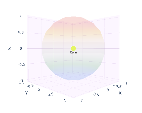
ValuOrb is a simplified representation of a non-Euclidean space.
Data is graphed around a central sphere.
Nodes can connect to the 'Core' to establish a visualization of crucial relationships.
The ValuOrb visualization can represent a variety of relationships through distance, color, and size.
